Roy Lichtenstein
- Josiah Forbes
- Oct 15, 2022
- 3 min read

Updated: Oct 17, 2022

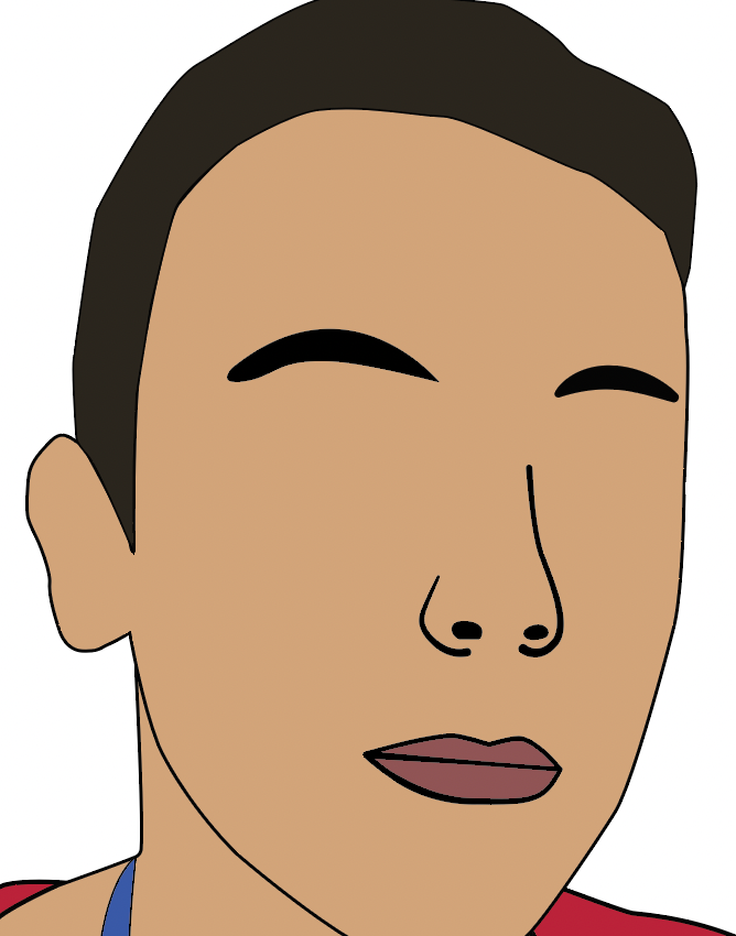
This is my Roy Lichtenstein Portrait I created in Illustrator
I started on a new A3 document, and I dragged my photo in to the project and used CMND + T to transform it to size.
Then on a new layer I used the Pen tool to make an outline of the face. I select black outline no fill, with 3 stroke


I Selected the face with the Selection Tool


Then with the face selected I made sure foreground was selected and chose the Eyedropper tool

and clicked on my face from the photo to fill to new layer with the right colour.

I made more new layers with the same method for each part of the portrait, Such as Hair, Neck, Mouth ect.
Now for the Nose I just used the pen tool without fills


Now I start using a new tool called the Width Tool. This tool allows me to change width of lines are specific points, For example using it on the ear I can adjust both ends of the line and made them thinner, and making the middle section wider then makes it look like it was created with a paintbrush.


I then drew a eye shape with the pen tool, Then used the Ellipse tool to make a black circle above it


Now I am going to use the selection tool, I held shift while I will clicked once on each object, to get both objects selected,


Now I need to divide the images into sections, so I go Window > Pathfinder
this opens the pathfinder window so I can press Divide.


Now its divided the image into sections so we can just delete the top one that overlaps, by using the Direct Selection Tool, Click on the section and press Delete on the keyboard.

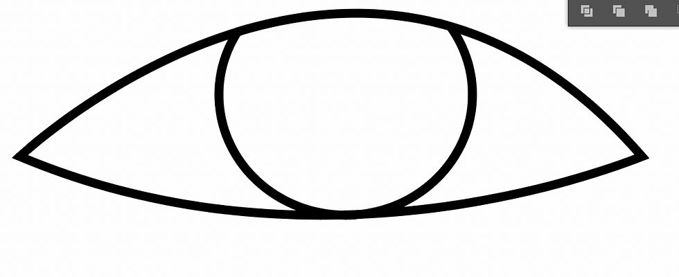
I made more circles with the Ellipse tool and coloured them with Fill/Stroke tool.
I used the width tool again to give the eyes outline the paintbrush tool
then I drew a eyelid with the pen tool.

Now to add the iconic Benday Dots. I will start with the face layer.
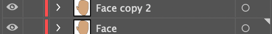
I'm going to solo my face so I can just focus on it, to do this hold ALT and click the Eye icon on the layer. This will turn off all other layers visibility


Now open the hamburger at the top of your layers panel and select, Duplicate Layer

Now u will have 2 layers of your face. the first one we will leave alone but the copy is where we will make the dots.
Now on the Face Copy layer have the face object selected and go
Window > Swatch libraries > Patterns > Basic Graphics > Basic Graphics_Dots

Now this box will pop up and u can chose the style u want. there's a wide range of dot sixes but I would go for one of the first 4 options.


Now the dots are there and if u want, you can adjust the opacity of this whole layer to make the dots seem less strong.

I repeated this process for the neck also.

Then I began working on the background scene. I started by making a gradient in photoshop as I was having difficulty making it work in illustrator.
I started on a new A3 Document in photoshop


I used the brush tool to draw lines of different shades of colours to make my gradient.


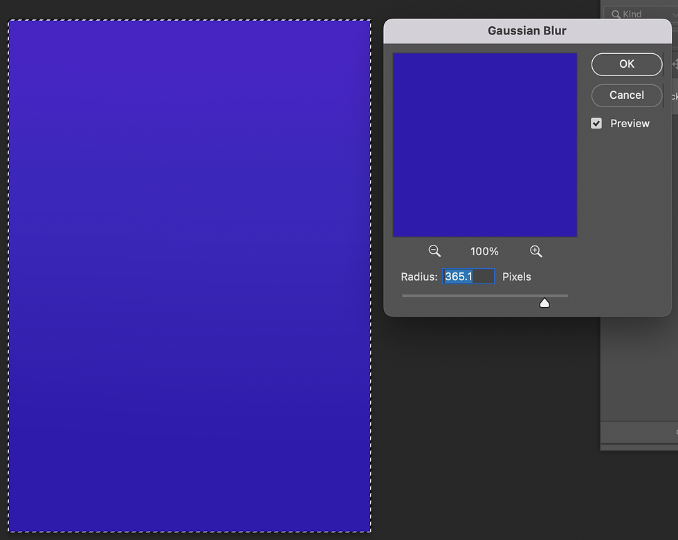
When the drawing was complete I pressed CMND + A to select all
then went to Filter > Blur > Gaussian Blur

I moved the slider to adjust the amount of blur.

Once it was at a good blend amount I pressed OK to apply changes.
Now my background gradient is finished so I'm going to save it

I went File > Export > Export As

I changed Format to JPG and set the quality to High.

Then pressed Export and put the file into my Roy Lichtenstein Folder in the Assets folder

Back in illustrator I made a new layer and set it below all the others. Then I dragged my image from finder into the canvas


Moving onto the buildings, I made a new layer just above the gradient and I used the Rectangle Tool to make shapes, then used Fill/stroke to colour them, and I used the Alt key to drag copies to make multiple rows quick and easy.


I also added lighting bolts with the pen tool on a separate layer

After all these steps here is my final portrait. I like how this one came out but I feel I could improve it and make it more successful by adding shadows and highlights to the work, and adding something more to background in the open space and maybe some more detail to the hair and shirt.


Comments